
The trouble with pastels is they just remind us of girly bedrooms, and that's fine if that's the end result required, but how to use this colour in a living room, kitchen or bloke's home?? The answer is to use in moderation.

This room works and is pleasant, but still rather over-the-top mauve/orchid. Perhaps if the curtains had been taupe or white the effect would have been rather more sophisticated.

This living room by Kelly Wearstler puts the mauvey tones in the rug and anchors the scheme with darker purple/grey shades. Still feminine, but not sickly.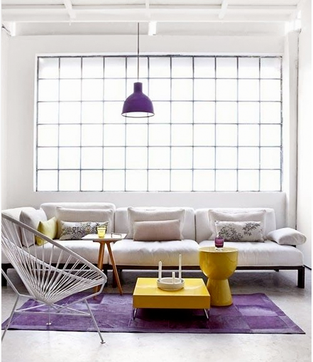
Here, just the rug and the pendant refer to the orchid tones, and even combined with primary yellow still manage to look sophisticated, thanks to tons of airy white and pared back accessories.
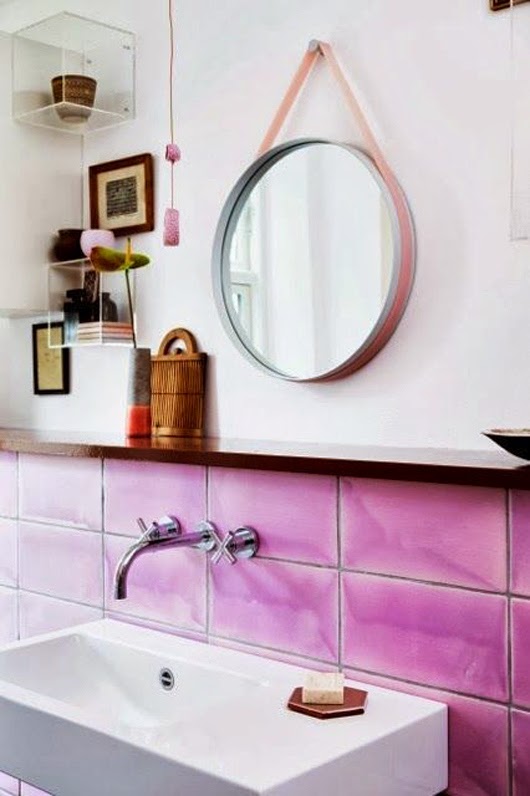
A radiant orchid splashback! Unusual, and because used sparingly, successful.
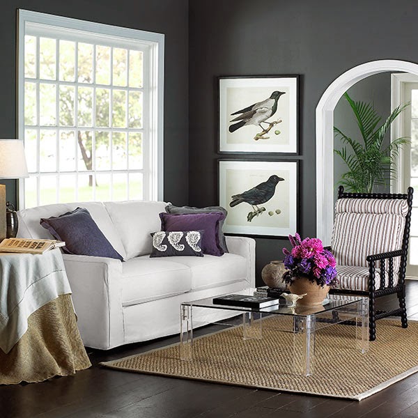
This room manages to be (almost) masculine and yet still use the purple and mauve colour family. White, grey and natural wood really enhance the orchid tones.

Of course, if it all gets too hard, then the easiest way to add a touch of radiant orchid is to use the original and best - flowers! Nature's way of safely adding colour to our living rooms!
No comments:
Post a Comment